Department of
Environmental Biology
Environmental biology students are exposed to concepts of biodiversity conservation, physiology, and ecology of plants, animals, and microorganisms. We study and emphasize the interactions and changes in biological systems in the context of many different fields including aquatic and wetland sciences, biotechnology, fisheries and wildlife biology, forest health and global ecology.

Meet the Chair
Dr. Jacqueline Frair
"From molecules to ecosystems, Environmental Biology is the fusion of basic science and applied ecology. Our students and faculty are actively engaged in addressing threats to the integrity of our ecosystems including invasive species, habitat loss, and climate change. Our students learn about the diversity of the earth’s plants, animals, fungi, and microbes while simultaneously learning how to protect them."
Undergraduate Degree Programs
EB offers six undergraduate majors. Environmental Biology is the broadest major and the degree program to which most students apply. The other five are specialized and recommended for students with more focused educational goals. They are Aquatic and Fisheries Science, Biotechnology, Conservation Biology, Forest Health, and Wildlife Science. In general, the first year requirements of these programs are similar and internal transfer among them is straightforward.
Aquatic and Fisheries Science
Work to conserve and restore biodiversity, habitats, and ecological function of our most precious ecosystems.
Learn More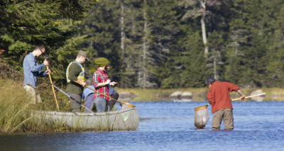
Biotechnology
Employing products or services of biological systems, organisms, cells and/or molecules to benefit humans, society, and our planet.
Learn More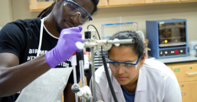
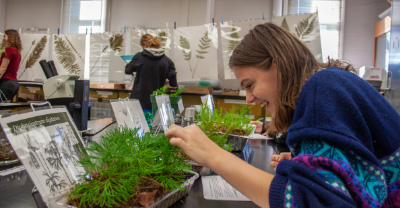
Environmental Biology
A broad biology major with electives covering topics from molecules to ecosystems to regional landscapes.
Forest Health
Forest health experts support healthy forests by managing threats caused by invasive species, poor management, climate change, fire, and other anthropogenic factors.
Learn More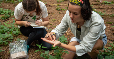
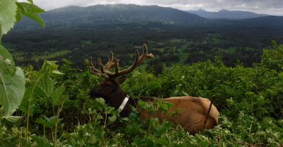
Wildlife Science
Gain ecological knowledge in a manner that strikes a balance between the needs of wildlife populations and the needs of people.
Learn more about our undergraduate programs
Department Career Outcomes
The expertise of our students have never been more in demand.
Our high placement rates mean students are prepared to transition from ESF undergraduate
to employment or graduate study.
Graduate Study
Get an M.S. or Ph.D. in Environmental Biology
Research areas include:
Aquatic & Fisheries Science
Chemical Ecology
Conservation Biology
Ecology & Evolution
Entomology
Environmental Biotechnology
Indigenous Peoples & the Environment
Microbiology
Molecular Biology & Ecology
Mycology & Forest Pathology
Plant Science
Wildlife Ecology & Management
Get an M.P.S.
Facilities and Research in Environmental Biology